The Hidden Power of Your Digital Persona
In the modern era of remote work, your home office is no longer just a private sanctuary. It has become your primary storefront. When you join a meeting, your video conferencing background acts as a silent messenger, whispering details about your personality and professional standards before you even say ‘hello’. Have you ever noticed how a cluttered shelf makes a speaker seem disorganized, even if their words are brilliant?
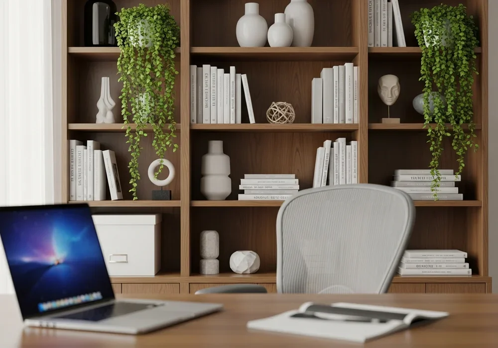
Think of your bookshelf as a curated gallery rather than a storage unit. It is a visual extension of your brand. A well-designed library backdrop projects authority, intellectual depth, and attention to detail. This isn’t just about ‘cleaning up’; it’s about strategic communication through interior design. We are moving beyond the ‘blur background’ phase into a Professional Podcast Studio”>into an era of authentic, intentional spaces.
By the end of this guide, you will understand how to transform a chaotic stack of books into a sophisticated set. We will dive into the geometry of the camera lens and the psychological impact of negative space. Honestly, these small adjustments can be the difference between looking like a temporary freelancer and a seasoned industry leader.
Finding Your ‘Target Area’ Before Touching a Single Book
The biggest mistake most people make is styling the entire room. In reality, the camera only sees a small slice of your world. I call this the ‘Target Area’. To find yours, sit in your usual chair and open your camera app. Mark the boundaries of what is visible on the screen. This is your canvas, and everything outside it simply doesn’t matter for the meeting.
Pay close attention to your sitting height. The most critical zone is the area directly behind your head and shoulders. If the shelf behind you is too high, it can feel like the books are ‘falling’ on you. Conversely, if it’s too low, you might look like you’re sitting in a basement. Ideally, the middle shelf should align with your eye level to create a sense of architectural stability.
Horizontal and vertical lines are your best friends here. Ensure your bookshelf is perfectly leveled. A slight tilt in the shelf can make the entire video conferencing background feel unstable, triggering a subconscious sense of unease in your viewers. Use the grid lines on your camera to align the shelf edges perfectly with the frame.
Why Your Bookshelf Layout Might Be Distracting Your Clients
Have you ever found yourself squinting at someone’s background trying to read a specific book title instead of listening to them? That is the ‘distraction trap’. Professional styling requires a balance between interest and neutrality. This is where the 60/40 Rule comes into play, a favorite principle among DesignHomes editors.
- 60% Books: This provides the intellectual foundation and texture.
- 40% Decor and Negative Space: This prevents visual claustrophobia and gives the eyes a place to rest.
Negative space, or empty space, is often overlooked. A bookshelf packed tight with books from end to end feels heavy and dated. By leaving intentional gaps, you create a modern, airy feel. It signals that you have room to grow and that you aren’t overwhelmed by your own resources. It’s a subtle power move in the world of home office interior design.
| Feature | Cluttered Shelf (Avoid) | Curated Shelf (Recommended) |
|---|---|---|
| Density | 100% full, no gaps | 60% books, 40% air/objects |
| Orientation | All vertical | Mix of vertical and horizontal |
| Color | Random, chaotic | Tone-on-tone or coordinated |
| Purpose | Pure storage | Visual storytelling |
Sorting by Color or Subject? The Psychology of Visual Rhythm
How you arrange your books dictates the ‘rhythm’ of your background. If you want a calm, serene atmosphere, try sorting by color. A soft gradient—moving from whites and creams to deeper blues—creates a soothing video conferencing background that doesn’t compete with your face for attention. It feels intentional and artistic.
For those who want to appear more academic or traditional, sorting by size and subject is key. However, avoid the ‘staircase’ effect where books get perfectly shorter in a line; it looks too rigid. Instead, create ‘clusters’. Group three or four large coffee table books horizontally, then place a few vertical books next to them. This varied height adds a dynamic, professional energy to the space.
If your book covers are too bright or distracting, here is a secret designer tip: the ‘Spine-in’ or ‘Reverse’ method. Turning the books so the pages face out creates a uniform, neutral palette of creams and tans. While controversial for bibliophiles, it works wonders for creating a high-end, minimalist zoom background that looks incredibly expensive on camera.
Small Details That Make a Huge Difference in Depth
Flat backgrounds are boring. To make your home office interior look like a professional studio, you need depth. This is achieved through layering and lighting. Never rely solely on the overhead light in your room; it creates harsh shadows under your eyes and makes the bookshelf look two-dimensional.
Try placing a small, warm LED strip or a ‘puck light’ on the underside of a shelf. This ‘wash’ of light highlights the textures of the books and creates a beautiful glow. It separates you from the background, making you pop on screen. Additionally, adding a ‘Planterier’ element—a small trailing ivy or a structured succulent—introduces life. The organic shape of a plant breaks up the hard rectangular lines of the books.
Personalize with caution. A single, sophisticated piece of art or a unique sculpture can be a great conversation starter. However, avoid family photos or overly personal items that might feel ‘too much’ for a corporate setting. The goal is to show personality without sacrificing professional boundaries. Think of it as ‘curated intimacy’.
The Final 60-Second Check Before You Hit ‘Join’
Before every important call, perform a ‘lens check’. Cameras often distort edges, making straight shelves look curved. Adjust your laptop height—usually by placing it on a stand or a stack of (ironically) books—so the camera is at eye level. This ensures the video conferencing background looks natural and not looming.
Check for ‘head-sprouts’. This happens when a trophy, a plant, or a tall book appears to be growing out of the top of your head on screen. Shift your chair or move the object slightly to the left or right. These tiny adjustments ensure that the focus remains entirely on you and your message.
Maintaining this space is just as important as creating it. Spend five minutes every Friday tidying your Target Area. A professional video conferencing background is a living part of your career toolkit. When your environment is orderly, your mind follows suit, allowing you to lead meetings with newfound confidence and style.
Frequently Asked Questions
Should I use a real bookshelf or a virtual background?
While high-quality virtual backgrounds exist, a real, styled bookshelf is always superior. It conveys authenticity and builds a level of trust that a digital filter simply cannot replicate. It shows you have invested in your workspace.
What if my home office is too small for a bookshelf?
You don’t need a wall-to-wall library. A single, well-styled ‘floating shelf’ or a small console table with a few curated books and a lamp can create the same professional effect within the camera’s frame.
Are bright colors okay in the background?
Subtle pops of color are fine, but avoid large blocks of neon or highly reflective surfaces. These can mess with your camera’s auto-exposure, either washing you out or making the background look like it’s vibrating.
자주 묻는 질문
Is it okay to have empty space on my shelves?
Absolutely. In fact, it’s encouraged! Empty space, or ‘negative space,’ makes the shelf look modern and prevents the background from feeling cluttered. Aim for about 20-40% of the shelf to be open or occupied by a single, simple object.
How do I prevent my books from looking messy on camera?
Align the spines of the books with the front edge of the shelf rather than pushing them all the way back. This creates a clean, uniform line that looks much sharper on a webcam.
What is the best lighting for a bookshelf background?
Avoid direct light from the front. Instead, use soft, indirect lighting within the shelves (like LED strips) to create depth, and ensure you have a primary light source (like a ring light or window) facing you at a 45-degree angle.

Kumar Tomar is a distinguished writer at DesignHomes.in, specializing in home design and interior decor. Holding a degree in Interior Design from the National Institute of Design, Kumar combines formal education with practical experience to deliver insightful and authoritative content. With over 8 years in the industry, he is known for his in-depth knowledge of design trends and his ability to provide actionable advice for homeowners. Kumar’s expertise and dedication to high-quality writing make him a trusted resource for those seeking to enhance their living spaces. Follow Kumar on Instagram for the latest design inspiration and tips.